How To Add a Sticky Header to Carrd
Let's see how you can add a sticky header to a Carrd website for a better experience.

In this tutorial, we are going to see how we can add a sticky header or navbar to a Carrd.co website to make it more interesting for your visitors. The code will need the Pro standard plan as we will need to use the embed widget, you don’t need to be on the latest plan as we will take the container ID.
There will be 2 codes, one that will make everything sticky or fix how you want to call it on mobile and PC and the second code that will make everything sticky on screens bigger than 600px.
Carrd Plugins and ThemesIf you are interested in more carrd tutorials you can check:
- Add Carrd Cookie Notice
- How To Add Pricing Table to Carrd.co
- Carrd.co Review
- How To Add Accordion FAQs Drop-Down to Carrd.co
- How To Add Custom Domain to Carrd.co
- Carrd.co Mobile Responsive Navbar
The complete list with Carrd plugins, themes and tutorials you can find on my carrdme.com website.
How To Add a Sticky Header to Carrd
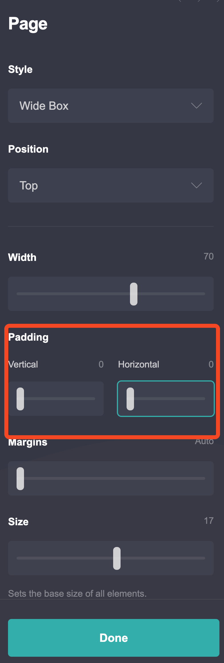
1. Set Carrd.co Page Settings
The first thing you need to do is to set the vertical and horizontal padding to 0 in the page settings, in case they are not 0 the floating navbar will not have the correct sizes and will not look good.

2. Get Container ID OR Add a Name to Container
In case you are not on the Pro Plus plan and you are on the standard plan you will need to get the ID of the container that is the header, to do that you need to use the inspect element in the browser as you see in the video. The ID is important as will be linked to the CSS that will make the header sticky. The video has everything you need,
In case you are on the Pro Plus plan you can add an ID to the container and use that in your CSS code, you just go to settings and add your ID there.
Carrd.co3. CSS Code
The next thing that you need to do is to add an embed widget and add the CSS code below, as mentioned there will be 2 codes, one that is making the header sticky everywhere and the other that is not making the code sticky on mobile
Stickey On Mobile Also
<style>
  #container01 {
    position: fixed !important;
    z-index: 99;
    top: 0;
  }
</style>
Stickey On Displays bigger Then 600px
<style>
  @media screen and (min-width: 600px) {
    #container01 {
      position: fixed !important;
      z-index: 99;
      top: 0;
    }
  }
</style>
In the above codes, you need to replace container01 with the ID of your container from second point
4. Add a Space
Carrd Plugins and ThemesThe next container will be pushed up and the website can look bad, to fix that you can add a divider and margins to the top of it, you can use the container below the paddings but is better to use the divider as you can control the mobile padding also, and in function off what you want you can play around. All the explanations are on the video
5. Save the page
After you are happy with the changes you can save it and see how it looks.
Carrd.coRelated Posts

How to Create A Carrd.co Mobile Responsive Navbar
Learn how you can add a Responsive Navbar to your carrd website that has a mobile toggle.

Upgrade Your Carrd.co Website With A Cookie Notice in Minutes
Enhance your website's functionality and legal compliance in just a few minutes with our easy-to-implement cookie notice code for Carrd.co.

How To Add Custom Domain to Carrd.co Website
Let's see how a custom domain name can be added to your carrd.co website.